Work takes me into a wide variety of structures. I've detailed, in this space, some of the historic structures where I find myself. I've documented the intriguing, the goofy and the "huh?". We had to inspect a Sherwin-Williams paint store warehouse several months ago. It serviced not only homeowners, but also contractors. There were the typical paint store accouterments about the front walls; paint chips, computer for matching colors; rollers and brushes; masking tape; all the stuff you'd find in any paint store.
We headed to the back, into the warehouse, because the job for which we were doing the inspection was adjacent to the back wall. We walked past cans of neutral base. I expected that. There were several different brands of neutral base. I was a bit surprised because I didn't know Sherwin-Williams owned all these different brands. The store manager said different bases have different sheens and have different tones to their colors. That's why they had a 30 foot wall of paint chips. What's yellow in one brand is more lemon in another. It's about giving the customer options.
At the back I saw this.
Rows and rows and palettes upon palettes of 10 gallon sized buckets of paint. These are broken down based on a customer's needs. Certain base colors are for certain mixed colors. They had four industrial mixers, giant red machines where they could make one of these Rembrandt Ruby or Calypso or Quest Gray. They can make large amounts of one color or several gallons of the same color. They service a number of Sherwin-Williams paint stores so these buckets are broken into gallons of base when a store needs more. Plus, a contractor painting all the hallways in an apartment building, for instance, will want 10 gallons of the same color. He can come here and they'll make it.
We've all purchased paint. It comes in a gallon can with a lid whose edge you bend when you have to use the screwdriver to open it because you lost that really neat thing they gave you at the store. It never occurred to me to consider where that gallon comes from. It was fascinating to do my job surrounded by what would become color. Finding this photo reminds me I never did paint the bathroom or the rear entry. I should do that.
Beverage: Cranberry Tea
Deb
Showing posts with label painting. Show all posts
Sunday, February 12, 2017
The Things You Learn
Thursday, June 9, 2016
The Things I See
The last couple of weeks have found me in a couple of very interesting buildings. The first object of a blog post is an auction house in the city. It's in a section of town which has gradually, over the last 10 years, seen urban renewal. The building itself used to be a printing house but is now a place of, for me, wonder at the art contained therein. To inspect the building was going to take some time. Fortunately, across the street was a brand-new Portillo's.
This is important for lunch, you know. I hadn't had a slice of their amazing chocolate cake in a long time. It's also great for the neighborhood. This location serves salads. My co-worker got their apple cranberry chicken salad and it looked very good. I usually order a polish, mustard only, fries and a medium Coke. (They don't serve Dr Pepper.) But I looked at her salad and thought, I could eat that. It looks delicious and better for me than a polish.
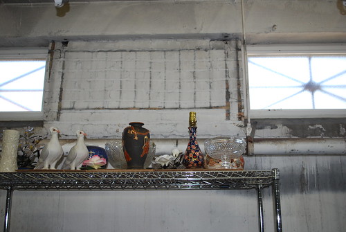
The building was 4 stories of treasures plus basement storage. I found the two turtle doves, but no partridge in a pear tree.
There was this sculpture sitting off to the side.
It's a light-weight bronze of cattails. I could see this in my yard. I have no idea if it was designed for the yard or if it's indoor only, but it's really distinctive.
There was this globe sitting on a table in amongst a section devoted to garden sculpture and wicker seating.
Again, I have no idea if this is something you could put on a pedestal and sit in your yard or is it only for, say, an enclosed patio or your living room. In any case, I don't have room for it but it's one of those things I'd covet.
They didn't have a lot of paintings. They don't deal with many of those, I was told, because other auction houses handle them. There is a thriving paintings market in Chicago, something I sort of suspected. The "knick-knacks" they have, if you will, are just as valuable, particularly when they are older and in excellent condition. But, they will take paintings for sale and the climate controlled nature of the building means they can sit for awhile without damage.
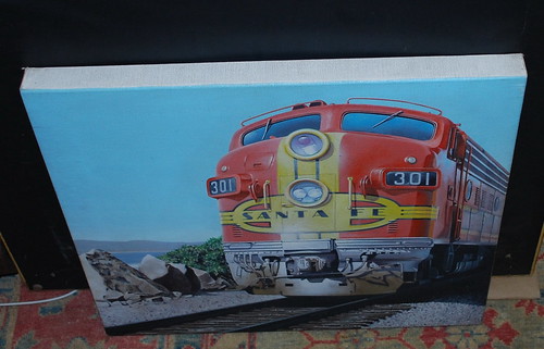
A long time ago, I used to edit a railroad historical publication. I have a few things in my house from those days. I saw this.
I'd hang this on my wall. I love the colors and how immediate the train is.
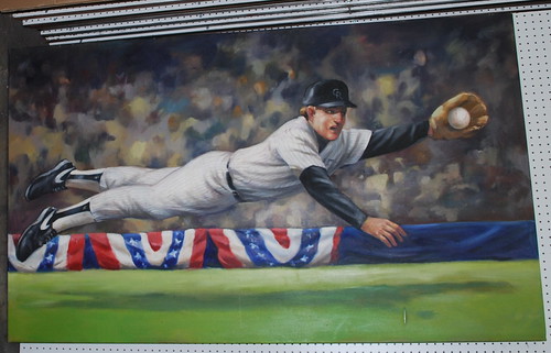
Also something I'd put on my wall is this one.
I've been in a lot of homes where there are art collections and it's rare to see baseball paintings. I like the action of the painting. It was big, 5 feet in length, so you'd need a large wall for it.
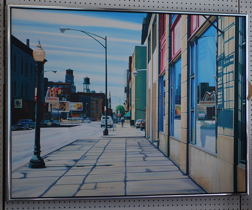
And there was this.
This is quintessentially Chicago. Mr. Submarine sub shop is not something I've encountered outside the Chicago city limits. It's a classic mix of old and new buildings on a street in the city. I've walked this street. I've taken photos along these streets. It's a hot summer day. The sub shop beckons. Air conditioning and an ice cold beverage. This was also a large painting. I would have to remove quite a bit of my current art to accommodate it. Still, I wouldn't have to repaint the walls. It would look good with my current paint scheme.
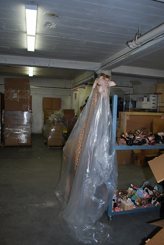
There was a giraffe under plastic because you know there would be.
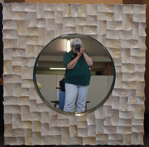
And there were mirrors, lots and lots of mirrors on one section of a floor. One, in particular, was ripe for a photo.
You know I rarely post photos of myself to this blog, but here I am, camera in hand, working. This mirror was huge. It functions more as an art piece than a mirror.
They have an upcoming auction of posters of Chicago and surrounding cities. Many were of the Art Deco age, highly stylized and touting taking the train or the South Shore Lines into Chicago or Indiana Dunes. There were 1933 World's Fair posters and general prints depicting 1930's-era Chicago. I recognized some landmarks, but there were a few prints showing buildings long gone. If I had a) the money and b) the wall space... The person I chatted with said art is the one thing which doesn't lose value. She said there are a lot of people with money in Chicago now and they are looking for distinctive pieces for their space. "You just need a couple thousand to get into collecting." Um...yeah. About that.
I'm content to just be in a space with art. I don't have to have it. I do understand the value of surrounding yourself with pieces which reflect your taste and which could appreciate in value. I also understand the need to patronize young artists so, if I'm going to buy, it's going to be from one of the many art festivals which seem to be every two or three weeks during the summer.
I very much enjoyed this inspection. It was a lot of walking and climbing of stairs but I could lose myself in the peace that comes from being surrounded by art.
Beverage: Earl Grey tea
Deb
This is important for lunch, you know. I hadn't had a slice of their amazing chocolate cake in a long time. It's also great for the neighborhood. This location serves salads. My co-worker got their apple cranberry chicken salad and it looked very good. I usually order a polish, mustard only, fries and a medium Coke. (They don't serve Dr Pepper.) But I looked at her salad and thought, I could eat that. It looks delicious and better for me than a polish.
The building was 4 stories of treasures plus basement storage. I found the two turtle doves, but no partridge in a pear tree.
There was this sculpture sitting off to the side.
It's a light-weight bronze of cattails. I could see this in my yard. I have no idea if it was designed for the yard or if it's indoor only, but it's really distinctive.
There was this globe sitting on a table in amongst a section devoted to garden sculpture and wicker seating.
Again, I have no idea if this is something you could put on a pedestal and sit in your yard or is it only for, say, an enclosed patio or your living room. In any case, I don't have room for it but it's one of those things I'd covet.
They didn't have a lot of paintings. They don't deal with many of those, I was told, because other auction houses handle them. There is a thriving paintings market in Chicago, something I sort of suspected. The "knick-knacks" they have, if you will, are just as valuable, particularly when they are older and in excellent condition. But, they will take paintings for sale and the climate controlled nature of the building means they can sit for awhile without damage.
A long time ago, I used to edit a railroad historical publication. I have a few things in my house from those days. I saw this.
I'd hang this on my wall. I love the colors and how immediate the train is.
Also something I'd put on my wall is this one.
I've been in a lot of homes where there are art collections and it's rare to see baseball paintings. I like the action of the painting. It was big, 5 feet in length, so you'd need a large wall for it.
And there was this.
This is quintessentially Chicago. Mr. Submarine sub shop is not something I've encountered outside the Chicago city limits. It's a classic mix of old and new buildings on a street in the city. I've walked this street. I've taken photos along these streets. It's a hot summer day. The sub shop beckons. Air conditioning and an ice cold beverage. This was also a large painting. I would have to remove quite a bit of my current art to accommodate it. Still, I wouldn't have to repaint the walls. It would look good with my current paint scheme.
There was a giraffe under plastic because you know there would be.
And there were mirrors, lots and lots of mirrors on one section of a floor. One, in particular, was ripe for a photo.
You know I rarely post photos of myself to this blog, but here I am, camera in hand, working. This mirror was huge. It functions more as an art piece than a mirror.
They have an upcoming auction of posters of Chicago and surrounding cities. Many were of the Art Deco age, highly stylized and touting taking the train or the South Shore Lines into Chicago or Indiana Dunes. There were 1933 World's Fair posters and general prints depicting 1930's-era Chicago. I recognized some landmarks, but there were a few prints showing buildings long gone. If I had a) the money and b) the wall space... The person I chatted with said art is the one thing which doesn't lose value. She said there are a lot of people with money in Chicago now and they are looking for distinctive pieces for their space. "You just need a couple thousand to get into collecting." Um...yeah. About that.
I'm content to just be in a space with art. I don't have to have it. I do understand the value of surrounding yourself with pieces which reflect your taste and which could appreciate in value. I also understand the need to patronize young artists so, if I'm going to buy, it's going to be from one of the many art festivals which seem to be every two or three weeks during the summer.
I very much enjoyed this inspection. It was a lot of walking and climbing of stairs but I could lose myself in the peace that comes from being surrounded by art.
Beverage: Earl Grey tea
Deb
Labels:
Art,
baseball,
Chicago,
humor,
inspections,
lunch,
money,
painting,
Portillos,
poster,
sculpture,
work
Saturday, March 19, 2016
Spring Project Or Paperweights
All those things you say you want to do. The list can be long, long, long. I tend to have motivation come in spurts. I'll feel exceptionally creative or motivated to accomplish something. Pieces will be collected and I'll get ready and bam. The motivation fades as quickly as it come.
I've been dealing with some issues with RA which I didn't realize were RA issues. I knew depression was a side effect of this. You gradually lose mobility and that can be very depressing. I can tell myself, repeatedly, to find gratitude in every day, but I often have to face the reality that I just cannot; that this gloomy mood is what I have. I find acknowledging the mood; feeding it even; works for me to slowly leave it behind. In the interim, I don't do much of anything. That can feed my sense of worthlessness. "If only I felt better, this project would be done."
Enter spring. It's hard for me not to feel a tug toward positivity when the crocus bloom and the sky turns blue and the winter coat goes in the closet for a good two weeks before being needed. I feel I can conquer things. I feel I can take those steps I've longed for to make my surroundings happier. That's necessary for my overall well-being. "Time to fix this," I think. Many times that enthusiasm, however, crashes headlong into the reality that I get tired more easily. Still, here we go with the rebirth of the grass in the back yard and the cacophony of birds in the trees.
Target didn't help diminish that exuberance. In one of my news feeds; ironically, a business feed; there was a discussion about their new Pillowfort line. Targeted to kids, it's gender neutral and features things without designations for boy or girl. It's part of Target's stated objective to make as much of their kids things for all kids, inclusive, rather than blue for boy and pink for girl. You can still find those things but girls like trucks and boys like dolls. Kids shouldn't be pigeonholed into colors and items because of their gender. I can't agree with this enough.
The article showed some items from the collection and one of them was a shelf unit.
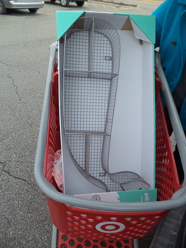
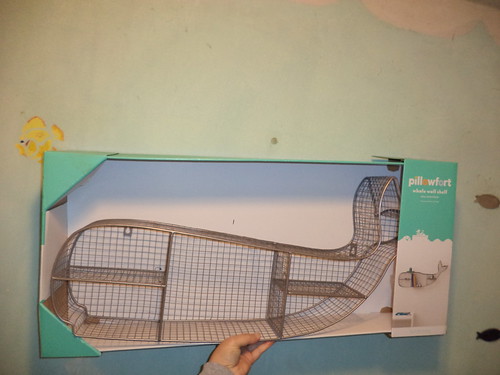
It's a whale! I read dimensions but I can't always get my head around sizes relative to anything else. I could order it online and pick it up at my local Target. As I had to get a few other things there, this was a score. It's big.
It's going to go on the wall opposite the medicine chest and sink. When I held it up to the wall, the sadness of the long ago paint scheme in the bathroom was overwhelming.
I need a fresh coat of paint on the walls. If I'm going to make this a focal point of the bathroom, I need walls reflective of that. As if they were mind reading, I got a flyer in the mail from Ace Hardware. There is, this weekend as I type, a buy-one, get one free sale on their best paint. Seriously? I would need painting accouterments as I tossed all that stuff last year, when I was cleaning in the basement for the new washer, because the stuff was old. But cutting the big cost, the paint, in half, could motivate me to actually do this.
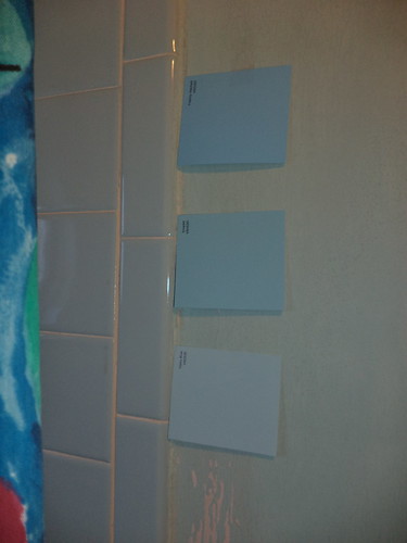
When I went to get garbage stickers, I asked about the smell. That could be a deal breaker. The smell, the volatile organic compounds, released as paint dries, are not good for people with breathing difficulties. I don't want my house to make me any sicker than it possibly is. If I have to wait until June, when I throw open the windows, would the paint have settled out? The good news is the sale paint is low VOC, suitable for pregnant women to paint walls with and it is guaranteed to not settle out for up to 9 months after being initially mixed. I grabbed some swatches and stuck them on the wall.
There is light blue tile in the tub/shower. I have a nautical theme in the bathroom which is why the whale shelf appealed to me. It's important to match, as close as I can, the tile. Ideally, you take a tile piece with you and they match it, but I have no idea where the extra tile is that I had. So, I picked what I thought might be close or complimentary.
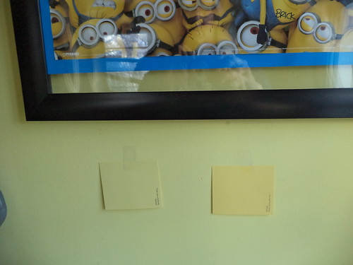
While I was there, I thought about the neglected back door area. I was going to paint that yellow to compliment the minion poster hanging there. If this is a buy one get one, what if I actually bought the yellow for the back? I grabbed some yellow swatches and slapped them on the wall by the poster.
I wound up going with the bottom blue and the left yellow. In my head, I thought a light lemon yellow would make the poster "pop" on the wall. But the light lemon they had seemed too light, washed out. Hence, I've gone with a color that is an exact match to the one there. Funny how that works out.
Here we are, the end of March. I have two brand new cans of paint in my house. One sits on the kitchen table and the other sits on the bathroom floor.
I'm going to paint the baseboards and the trim around the door this blue. It will be immersion, which is why having a light color on the wall will work. The ceiling will be a bright white, when I get that far. Right now, I have to get the counted cross-stitch project done and I have a few days upcoming when I can just sit and stitch. I also have to prepare the wall for painting.
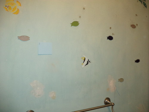
Gone will be the fish stencils and those solid color fish "stickers". They are a gel plastic. I forget how old they are. Carole was living at home when we found them somewhere and thought they would be cool. They have been, but, over the years, they have attracted and held dust and dirt. I just didn't have the gumption to pry them off the wall and repaint. I'll have to take the towel rack off the wall. I don't relish that. My fear is that I won't get it back up.
In my mind's eye, I picture doing this wall, then resting. Next would be the wall by the door and a rest. Then the wall by the sink and stool and ending with the bit of wall above the shower. It's a month-long project or, if I take a week off work, a full week's painting. The same thing goes for the back door area. A wall a week and it's done.
So, with the advent of spring, this is what inspiration looks like. Supposedly, this paint can be written on with chalk. If so, that could provide some artistic avenues in a nautical bathroom. Or I could buy this or this. Maybe the fact that I have cans of paint will keep me motivated to get this done. These are awfully expensive paperweights.
Beverage: Dr Pepper
Deb
I've been dealing with some issues with RA which I didn't realize were RA issues. I knew depression was a side effect of this. You gradually lose mobility and that can be very depressing. I can tell myself, repeatedly, to find gratitude in every day, but I often have to face the reality that I just cannot; that this gloomy mood is what I have. I find acknowledging the mood; feeding it even; works for me to slowly leave it behind. In the interim, I don't do much of anything. That can feed my sense of worthlessness. "If only I felt better, this project would be done."
Enter spring. It's hard for me not to feel a tug toward positivity when the crocus bloom and the sky turns blue and the winter coat goes in the closet for a good two weeks before being needed. I feel I can conquer things. I feel I can take those steps I've longed for to make my surroundings happier. That's necessary for my overall well-being. "Time to fix this," I think. Many times that enthusiasm, however, crashes headlong into the reality that I get tired more easily. Still, here we go with the rebirth of the grass in the back yard and the cacophony of birds in the trees.
Target didn't help diminish that exuberance. In one of my news feeds; ironically, a business feed; there was a discussion about their new Pillowfort line. Targeted to kids, it's gender neutral and features things without designations for boy or girl. It's part of Target's stated objective to make as much of their kids things for all kids, inclusive, rather than blue for boy and pink for girl. You can still find those things but girls like trucks and boys like dolls. Kids shouldn't be pigeonholed into colors and items because of their gender. I can't agree with this enough.
The article showed some items from the collection and one of them was a shelf unit.
It's a whale! I read dimensions but I can't always get my head around sizes relative to anything else. I could order it online and pick it up at my local Target. As I had to get a few other things there, this was a score. It's big.
It's going to go on the wall opposite the medicine chest and sink. When I held it up to the wall, the sadness of the long ago paint scheme in the bathroom was overwhelming.
I need a fresh coat of paint on the walls. If I'm going to make this a focal point of the bathroom, I need walls reflective of that. As if they were mind reading, I got a flyer in the mail from Ace Hardware. There is, this weekend as I type, a buy-one, get one free sale on their best paint. Seriously? I would need painting accouterments as I tossed all that stuff last year, when I was cleaning in the basement for the new washer, because the stuff was old. But cutting the big cost, the paint, in half, could motivate me to actually do this.
When I went to get garbage stickers, I asked about the smell. That could be a deal breaker. The smell, the volatile organic compounds, released as paint dries, are not good for people with breathing difficulties. I don't want my house to make me any sicker than it possibly is. If I have to wait until June, when I throw open the windows, would the paint have settled out? The good news is the sale paint is low VOC, suitable for pregnant women to paint walls with and it is guaranteed to not settle out for up to 9 months after being initially mixed. I grabbed some swatches and stuck them on the wall.
There is light blue tile in the tub/shower. I have a nautical theme in the bathroom which is why the whale shelf appealed to me. It's important to match, as close as I can, the tile. Ideally, you take a tile piece with you and they match it, but I have no idea where the extra tile is that I had. So, I picked what I thought might be close or complimentary.
While I was there, I thought about the neglected back door area. I was going to paint that yellow to compliment the minion poster hanging there. If this is a buy one get one, what if I actually bought the yellow for the back? I grabbed some yellow swatches and slapped them on the wall by the poster.
I wound up going with the bottom blue and the left yellow. In my head, I thought a light lemon yellow would make the poster "pop" on the wall. But the light lemon they had seemed too light, washed out. Hence, I've gone with a color that is an exact match to the one there. Funny how that works out.
Here we are, the end of March. I have two brand new cans of paint in my house. One sits on the kitchen table and the other sits on the bathroom floor.
I'm going to paint the baseboards and the trim around the door this blue. It will be immersion, which is why having a light color on the wall will work. The ceiling will be a bright white, when I get that far. Right now, I have to get the counted cross-stitch project done and I have a few days upcoming when I can just sit and stitch. I also have to prepare the wall for painting.
Gone will be the fish stencils and those solid color fish "stickers". They are a gel plastic. I forget how old they are. Carole was living at home when we found them somewhere and thought they would be cool. They have been, but, over the years, they have attracted and held dust and dirt. I just didn't have the gumption to pry them off the wall and repaint. I'll have to take the towel rack off the wall. I don't relish that. My fear is that I won't get it back up.
In my mind's eye, I picture doing this wall, then resting. Next would be the wall by the door and a rest. Then the wall by the sink and stool and ending with the bit of wall above the shower. It's a month-long project or, if I take a week off work, a full week's painting. The same thing goes for the back door area. A wall a week and it's done.
So, with the advent of spring, this is what inspiration looks like. Supposedly, this paint can be written on with chalk. If so, that could provide some artistic avenues in a nautical bathroom. Or I could buy this or this. Maybe the fact that I have cans of paint will keep me motivated to get this done. These are awfully expensive paperweights.
Beverage: Dr Pepper
Deb
Labels:
Ace Hardware,
bathroom,
Carole,
color,
depression,
kitchen,
minions,
painting,
Rheumatoid Arthritis,
spring,
Target
Saturday, February 20, 2016
Red
It's time to get the Fantasia poster framed for my office wall. It started with a black poster frame.
The frame came apart very easily, even though there is printing on the instructions not to remove the plastic "glass" part from the frame. It's just glued in in strategic spots around the frame so it didn't require much muscle to pop it out.
Since the frame was black and I needed red, I had to consider how to change that. If I wanted to custom frame the poster, with costs upwards of $250, I could get a red frame. I just want to spend $20. Black seems to be your only choice, unless you take your problem to an art supply store.
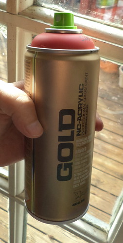
ViolÄ. Originally, I expected to have to buy a tube of red acrylic paint and a brush and then spend hours meticulously brushing paint across a frame. It would require quite a bit because there would be, inevitably, brush strokes to hide and I couldn't be completely certain the paint would adhere. I put the problem to my local Dick Blick art supply store and he suggested red spray paint. I could get exactly the color I wanted and other than needing to not do this all in one shot because, you know, paint fumes, this particular paint would be perfect. This brand is made for spray painting on anything, from plastic poster frames to brick, concrete and steel. It's the preferred spray paint of outdoor artists. And here I thought they just went to the hardware store and bought a can of Rust-o-leum. It was $6 for this.
The hard part was going to be the actual spraying. If it was spring, summer or fall, I could take the frame out to the back yard, spray it and let it dry and air outside. Since it was February and I wanted this done, I needed to come up with some way to do it without making myself sick.
Step 1 was commandeering some cardboard from the office.
The frame came apart very easily, even though there is printing on the instructions not to remove the plastic "glass" part from the frame. It's just glued in in strategic spots around the frame so it didn't require much muscle to pop it out.
Since the frame was black and I needed red, I had to consider how to change that. If I wanted to custom frame the poster, with costs upwards of $250, I could get a red frame. I just want to spend $20. Black seems to be your only choice, unless you take your problem to an art supply store.
ViolÄ. Originally, I expected to have to buy a tube of red acrylic paint and a brush and then spend hours meticulously brushing paint across a frame. It would require quite a bit because there would be, inevitably, brush strokes to hide and I couldn't be completely certain the paint would adhere. I put the problem to my local Dick Blick art supply store and he suggested red spray paint. I could get exactly the color I wanted and other than needing to not do this all in one shot because, you know, paint fumes, this particular paint would be perfect. This brand is made for spray painting on anything, from plastic poster frames to brick, concrete and steel. It's the preferred spray paint of outdoor artists. And here I thought they just went to the hardware store and bought a can of Rust-o-leum. It was $6 for this.
The hard part was going to be the actual spraying. If it was spring, summer or fall, I could take the frame out to the back yard, spray it and let it dry and air outside. Since it was February and I wanted this done, I needed to come up with some way to do it without making myself sick.
Step 1 was commandeering some cardboard from the office.
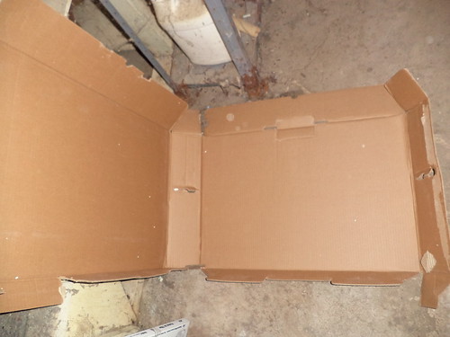
We have a TV in the office for training videos and this was the box in which it came. I pulled it apart and took it to the basement.
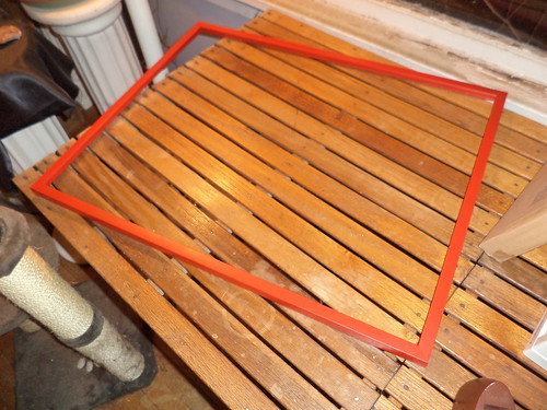
The frame fit nicely inside this "L" shaped box. I wouldn't be spraying the whole thing at once.
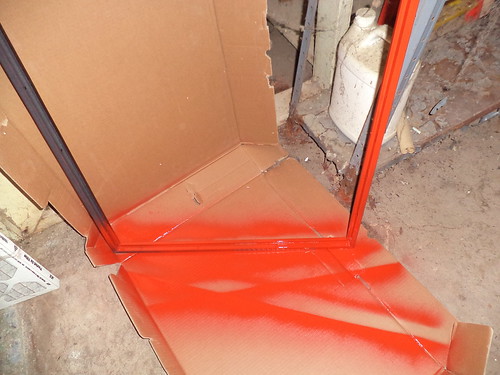
Every time I went into the basement to do a load of laundry, I worked a bit more on the frame. First one side was painted, and then the other.
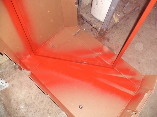
I had to make sure the inside of the frame and then the outside were painted. The box worked like a charm. The biggest problem was the smell. If ever I needed an example of how scents travel it was this. I'd do a section of the frame and let that dry. Then the heat would kick in and I'd smell the toluene or whatever it is in the can, in the home office. It had been sucked into the air vents and sent around the house. After a couple tries, I learned, very quickly, that I could only do one side of the frame at a time. This would lengthen the time it took to get it done, but I wouldn't be coughing for a couple hours later due to the smell.
It came out very nice.
Now to see how it looks assembled.
It's perfect. I matched the red with the color of the words. It's at the office, but not hung. I need to get more of those instant hanger things that don't damage your walls. I'm happy. It did use about 3/4ths of the can of spray paint to do this, owing to all the sides in a frame. That's fine. Realistically, what am I going to do with a can of red spray paint? I did think, since this is made to be used on any surface, I could use it up on the deck come spring, maybe paint the bottom lattice part. I just don't want a partially empty can of paint in the basement for the next 15 years.
Beverage: Dr Pepper
Deb
Tuesday, January 19, 2016
Evolution-Part 3
So, what does the office look like now, right now. Well, looking east northeast, you have this view.
There is a clock radio and an old lap top computer sitting on top of the bookshelf. I'm taking the clock radio home with me. I thought it would pick up my jazz station but it doesn't. We are very close to the transmission tower for WBBM radio but that shouldn't matter with the signal. It's all staticy. I have several bags of give away stuff to which I'll add it. The framed photo is from our first trip to Walt Disney World back in 1990. It's of a sign we saw in what used to be MGM-Hollywood. We were in line to see the Muppet Babies show. It says, "You are neither here nor there". So many days feel like that.
I have photo albums from old jobs on the second shelf. The third shelf has a clipboard and yellow legal pads for when I go into the field, as well as a dictionary. The bottom shelf has my work boots and my safety vests. That blue bag you see on the floor has a couple awards and a framed cross-stitch. Those were behind me in the old office and will go behind me here. I need to get more of those 3M picture hanging things which simply adhere to the wall. I use them at home and they are wonderful. I don't feel like putting holes in the new wall to hang my stuff.
Here's looking east southeast.
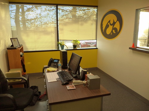
You can see how well the decal works. That's my aloe and geranium in the window. the sill is very wide and they would work to sit there forever, but I really want a decorative plant stand. I have an elephant-shaped watering can and I could put that on the bottom shelf of a plant stand. Right now, I take the geranium to the sink in the kitchen and drench it. I should put it in something other than the green plastic container it was in at the nursery.
I'm not sure about stenciling something along the wall. I had thought of a row of small tiger hawks right under the sill. Then I though about flowers above the window. Right now, I like it plain. The yellow is bright and sunny and is such a mood elevator, even on these bitter cold or heavily overcast days. I like being able to look out and across for a good ways. The sun is in my eyes for about 15 minute in the morning now, but I don't mind. I didn't have much more than a parking lot view in the old office and I didn't put my desk where I could see out because that put my back to the door, which I did not like.
This is looking west northwest.
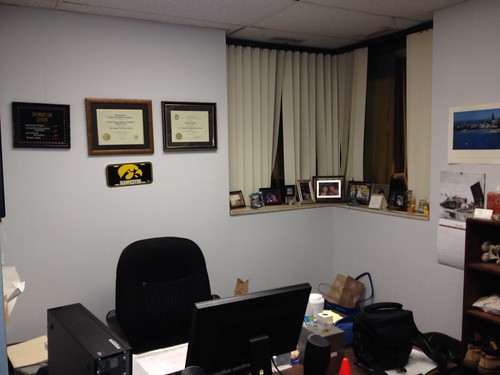
I love the dark gray. Black would have been way too dark. I got paint to paint the frame for the Fantasia poster and just need to get that done. Once it's done, then I can bring the Hawkeye 12-0 season poster and Fantasia and figure out where to put them. I think I want the corner to be my picture area. I've got this huge ivory wall behind me, but I don't want to fill it completely with stuff. I have a panoramic photo of Chicago that I'm just not sure where to put. I need to get the posters up first and then I'll have a better feel for where to put the Chicago poster.
Believe it or not, my office is the most personalized. Other people just don't seem to be into hanging stuff other than phone numbers on post its, on their walls. Gene is a new dad so he has photos of his daughter on a bookshelf in his office, but he has all this wall space and there's nothing on it. Maybe it's me in that I like to be surrounded by things that make me happy.
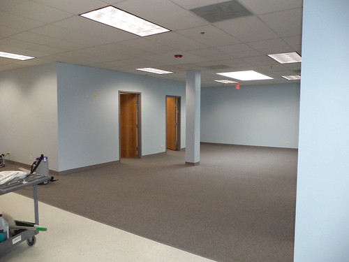
You can see into the main office there, a bit. We had a long discussion about the color of that space. Mike had picked out a more muted blue; one that had more gray in it. I wasn't sure that was a good color and suggested the color we ultimately chose. It works perfectly. It's bright and inviting but not loud. We have a skylight in that main area and this blue works perfectly with the natural light. If you're looking for paint, well, they left us the unused gallons.
So, I went from this...
(Those are the awards and the cross-stitch I have to put up.) to this.
(Nancy, your design suggestion was perfect.) Yeah, I think this works.
Beverage: Water
Deb
There is a clock radio and an old lap top computer sitting on top of the bookshelf. I'm taking the clock radio home with me. I thought it would pick up my jazz station but it doesn't. We are very close to the transmission tower for WBBM radio but that shouldn't matter with the signal. It's all staticy. I have several bags of give away stuff to which I'll add it. The framed photo is from our first trip to Walt Disney World back in 1990. It's of a sign we saw in what used to be MGM-Hollywood. We were in line to see the Muppet Babies show. It says, "You are neither here nor there". So many days feel like that.
I have photo albums from old jobs on the second shelf. The third shelf has a clipboard and yellow legal pads for when I go into the field, as well as a dictionary. The bottom shelf has my work boots and my safety vests. That blue bag you see on the floor has a couple awards and a framed cross-stitch. Those were behind me in the old office and will go behind me here. I need to get more of those 3M picture hanging things which simply adhere to the wall. I use them at home and they are wonderful. I don't feel like putting holes in the new wall to hang my stuff.
Here's looking east southeast.
You can see how well the decal works. That's my aloe and geranium in the window. the sill is very wide and they would work to sit there forever, but I really want a decorative plant stand. I have an elephant-shaped watering can and I could put that on the bottom shelf of a plant stand. Right now, I take the geranium to the sink in the kitchen and drench it. I should put it in something other than the green plastic container it was in at the nursery.
I'm not sure about stenciling something along the wall. I had thought of a row of small tiger hawks right under the sill. Then I though about flowers above the window. Right now, I like it plain. The yellow is bright and sunny and is such a mood elevator, even on these bitter cold or heavily overcast days. I like being able to look out and across for a good ways. The sun is in my eyes for about 15 minute in the morning now, but I don't mind. I didn't have much more than a parking lot view in the old office and I didn't put my desk where I could see out because that put my back to the door, which I did not like.
This is looking west northwest.
I love the dark gray. Black would have been way too dark. I got paint to paint the frame for the Fantasia poster and just need to get that done. Once it's done, then I can bring the Hawkeye 12-0 season poster and Fantasia and figure out where to put them. I think I want the corner to be my picture area. I've got this huge ivory wall behind me, but I don't want to fill it completely with stuff. I have a panoramic photo of Chicago that I'm just not sure where to put. I need to get the posters up first and then I'll have a better feel for where to put the Chicago poster.
Believe it or not, my office is the most personalized. Other people just don't seem to be into hanging stuff other than phone numbers on post its, on their walls. Gene is a new dad so he has photos of his daughter on a bookshelf in his office, but he has all this wall space and there's nothing on it. Maybe it's me in that I like to be surrounded by things that make me happy.
You can see into the main office there, a bit. We had a long discussion about the color of that space. Mike had picked out a more muted blue; one that had more gray in it. I wasn't sure that was a good color and suggested the color we ultimately chose. It works perfectly. It's bright and inviting but not loud. We have a skylight in that main area and this blue works perfectly with the natural light. If you're looking for paint, well, they left us the unused gallons.
So, I went from this...
(Those are the awards and the cross-stitch I have to put up.) to this.
(Nancy, your design suggestion was perfect.) Yeah, I think this works.
Beverage: Water
Deb
Labels:
Art,
Chicago,
color,
Gene,
geraniums,
Iowa Hawkeyes,
Nancy,
office,
painting,
photo,
Walt Disney World,
work
Thursday, December 3, 2015
"It's so you, Deb."
Between the post below and today, there was a visit to the new office. The walls are up and the painting is done. We walked in and knew this was going to be a place we can work comfortably in for years.
There is a huge amount of space here. We're going to put a large conference table by the post. That couldn't be moved. We're going to get a large TV to hang on the wall. The office schedule and some of the other programs we use will be on this TV. Everyone will be able to see where people and equipment are. We joked that we'll be happily ensconced in the office come NCAA men's basketball time so we can watch the Wednesday-Friday daytime games out here. Um...right. The far wall will have our equipment lists and there is room for our fax (yes, some clients use only fax), copier and printer AND boxes of supplies for all of those machines. There will be room to move around someone who is at the copier, if you have to use the printer, a luxury we don't have now.
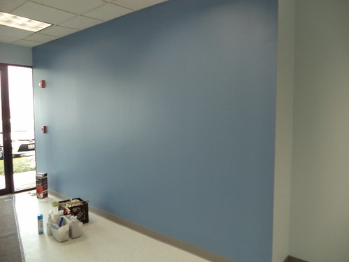
This is the accent wall to the left when you walk in.
Eventually, we'll stencil the company logo and name on the wall. That's a task for when it's winter and we're not pulling out hair out trying to get work done.
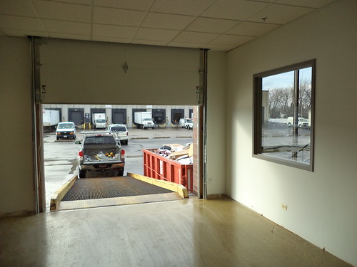
We have a large store room at the west end of the suite.
That's Gene checking out the small stand sink we have in the corner. The floor is sealed concrete. We did not need or want, tile in this area because, and we're so excited about this feature,
we have a drive up ramp. We'll be able to back our cars in to load and unload without having to traipse through the office or lug things up or down stairs or through 3 doors. All of our equipment and supplies will be in this room. It looks huge but we are thinking it will fill up fairly quickly, once everything gets moved in. Our equipment goes into the ground so having a sink where we can wash off pieces is wonderful. We don't need much.
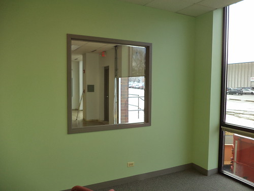
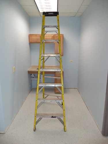
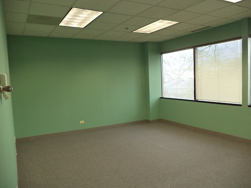
Gene, Matt and Tara have windows that overlook the store room. We all got to pick our office colors. This is Gene's.
"Cucumber for the win!" he said. Once it got up on the walls, he's thinking, with the west windows, it may be too bright.
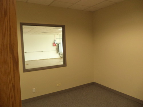
Matt went with a dark ivory.
You can see how the office looks into the storage area. Matt's office doesn't have windows or a skylight so having this window into the storage area with it's large floor to ceiling windows will provide him with some natural light.
And then there's Tara's office.
That's...blue. She originally wanted a royal blue, which would be a shade darker than this. It's the color of the Buffalo Sabers, her favorite hockey team. But, when she looked at the unpainted drywall and her paint color, she felt the royal blue would be too dark. I love this color, but not on all four walls. She hasn't seen this yet.
We have a storage room and another office which were painted in the color Matt chose; nice and neutral. We will need to hire another person next year. If they want a different color than Matt's color, we'll deal with it then.
We have a small kitchenette.
We're getting a "dorm fridge" to go in the space. We don't cook meals here beyond what we can microwave, and there will be enough room for a coffee maker for Matt and Tara. The rest of us don't drink coffee. What paper goods we use; paper plates, napkins, utensils, will fit in the cupboards.
This is Mike's office.
Once he saw this color on all the walls, he wasn't very happy with it. I don't think it's a bad color, but I think it's a bit overpowering for all four walls. However, I did point out that we're seeing the naked walls. Gene and Mike may be happy with their colors once they get stuff up on the walls, same with Tara's color.
The walls in the men's and women's bathrooms are this dark tan.
Tara and I are going to add wall paper borders and other items to give each bathroom a distinct character. The first one we will do, the women's bathroom, obviously, is going to be beach accents. The bathrooms are huge because they have to be compliant with the Americans With Disabilities Act. And, we found out that village code requires that bathrooms be delineated by sex if there is more than one. We have all agreed that if one bathroom is being used and the other is free, we're using it.
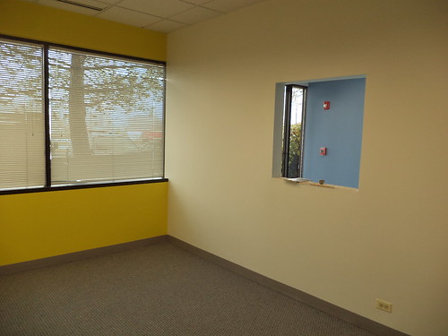
Finally, the moment you've all been waiting for. This is looking southeast.
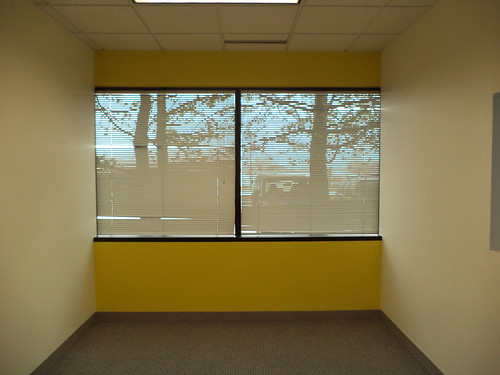
The hole in the south wall is for the sliding glass window. That's Hawkeye gold on the east wall. Here's a better photo of the east wall.
I love, love, love that yellow. The two side walls are an ivory. And here is the west wall.
The dark gray is perfect. Right now, the focal piece on this wall is going to be my "Fantasia" poster. I have to get an actual frame for it. I'm going to paint the frame red. I think I will also put framed items from this magical Hawkeye football season in this corner, in black and gold frames. I have some awards and a counted cross-stitch piece currently on the wall behind me, but those will go at the west end of south wall, along with some of the photos I have on the window ledge in my current office. I need to get a plant stand to put in the left corner of the window and, if they take all my bookshelves for use in our "library", then I'll get another one to house the few things I have on shelves. That would go to the east side of the sliding window.
This is the best part, however.
This is the sliding window. Under this will be an 18 inch shelf for incoming and outgoing mail. Plus, I can see if anyone comes into the office. The view when you look through here? Remember this?
Oh yeah. I can hardly wait to figure out how to stencil this on the wall.
Yes, I would agree this office is so me. It's much bigger than my current office. It's got so much more light. And the paint scheme reflects exactly who I am. We are starting our move this coming week. The door should be keyed on Monday. Hello color. Hello excitement.
Beverage: Dr Pepper
Deb
There is a huge amount of space here. We're going to put a large conference table by the post. That couldn't be moved. We're going to get a large TV to hang on the wall. The office schedule and some of the other programs we use will be on this TV. Everyone will be able to see where people and equipment are. We joked that we'll be happily ensconced in the office come NCAA men's basketball time so we can watch the Wednesday-Friday daytime games out here. Um...right. The far wall will have our equipment lists and there is room for our fax (yes, some clients use only fax), copier and printer AND boxes of supplies for all of those machines. There will be room to move around someone who is at the copier, if you have to use the printer, a luxury we don't have now.
This is the accent wall to the left when you walk in.
Eventually, we'll stencil the company logo and name on the wall. That's a task for when it's winter and we're not pulling out hair out trying to get work done.
We have a large store room at the west end of the suite.
That's Gene checking out the small stand sink we have in the corner. The floor is sealed concrete. We did not need or want, tile in this area because, and we're so excited about this feature,
we have a drive up ramp. We'll be able to back our cars in to load and unload without having to traipse through the office or lug things up or down stairs or through 3 doors. All of our equipment and supplies will be in this room. It looks huge but we are thinking it will fill up fairly quickly, once everything gets moved in. Our equipment goes into the ground so having a sink where we can wash off pieces is wonderful. We don't need much.
Gene, Matt and Tara have windows that overlook the store room. We all got to pick our office colors. This is Gene's.
"Cucumber for the win!" he said. Once it got up on the walls, he's thinking, with the west windows, it may be too bright.
Matt went with a dark ivory.
You can see how the office looks into the storage area. Matt's office doesn't have windows or a skylight so having this window into the storage area with it's large floor to ceiling windows will provide him with some natural light.
And then there's Tara's office.
That's...blue. She originally wanted a royal blue, which would be a shade darker than this. It's the color of the Buffalo Sabers, her favorite hockey team. But, when she looked at the unpainted drywall and her paint color, she felt the royal blue would be too dark. I love this color, but not on all four walls. She hasn't seen this yet.
We have a storage room and another office which were painted in the color Matt chose; nice and neutral. We will need to hire another person next year. If they want a different color than Matt's color, we'll deal with it then.
We have a small kitchenette.
We're getting a "dorm fridge" to go in the space. We don't cook meals here beyond what we can microwave, and there will be enough room for a coffee maker for Matt and Tara. The rest of us don't drink coffee. What paper goods we use; paper plates, napkins, utensils, will fit in the cupboards.
This is Mike's office.
Once he saw this color on all the walls, he wasn't very happy with it. I don't think it's a bad color, but I think it's a bit overpowering for all four walls. However, I did point out that we're seeing the naked walls. Gene and Mike may be happy with their colors once they get stuff up on the walls, same with Tara's color.
The walls in the men's and women's bathrooms are this dark tan.
Tara and I are going to add wall paper borders and other items to give each bathroom a distinct character. The first one we will do, the women's bathroom, obviously, is going to be beach accents. The bathrooms are huge because they have to be compliant with the Americans With Disabilities Act. And, we found out that village code requires that bathrooms be delineated by sex if there is more than one. We have all agreed that if one bathroom is being used and the other is free, we're using it.
Finally, the moment you've all been waiting for. This is looking southeast.
The hole in the south wall is for the sliding glass window. That's Hawkeye gold on the east wall. Here's a better photo of the east wall.
I love, love, love that yellow. The two side walls are an ivory. And here is the west wall.
The dark gray is perfect. Right now, the focal piece on this wall is going to be my "Fantasia" poster. I have to get an actual frame for it. I'm going to paint the frame red. I think I will also put framed items from this magical Hawkeye football season in this corner, in black and gold frames. I have some awards and a counted cross-stitch piece currently on the wall behind me, but those will go at the west end of south wall, along with some of the photos I have on the window ledge in my current office. I need to get a plant stand to put in the left corner of the window and, if they take all my bookshelves for use in our "library", then I'll get another one to house the few things I have on shelves. That would go to the east side of the sliding window.
This is the best part, however.
This is the sliding window. Under this will be an 18 inch shelf for incoming and outgoing mail. Plus, I can see if anyone comes into the office. The view when you look through here? Remember this?
Oh yeah. I can hardly wait to figure out how to stencil this on the wall.
Yes, I would agree this office is so me. It's much bigger than my current office. It's got so much more light. And the paint scheme reflects exactly who I am. We are starting our move this coming week. The door should be keyed on Monday. Hello color. Hello excitement.
Beverage: Dr Pepper
Deb
Tuesday, December 1, 2015
Office Space
The move has been delayed. It's not that we're not ready, we're more than ready, but our Internet provider can't guarantee a date they will get our Internet installed. The only good news with this is we don't have to be out of our current offices until January 31st. Still, who wants to be moving in January? Frustration.
Before I left for my California vacation, I went to the new space to see my office. They had all the framing up for the other offices and our large equipment storage area. There was a huge kerfluffle about the "kitchen". Without checking with us, they made a closet at the front, where you walk in, 2.5 times the size we directed. This cut our kitchen space in half. Because of ADA requirements, the things we wanted to do in the kitchen could not be possible. To say Mike was angry was something of an understatement. Of course, the contractor absolved himself of any mistake, saying he worked off the plans and the architect, who drew up the plans, says what they built is not what he designed. The bottom line is that we had to do work arounds for what we wanted because of bathroom size and that they had walls framed up already. Realistically, we don't need much. Unfortunately, the requirements of the job are such that someone with a wheelchair would not be a candidate for employment with us unless we decide we need solely office help. Therefore, we can get by with what is a huge disappointment in a kitchen.
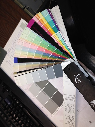
We were given a large palette of color samples and told to pick colors.
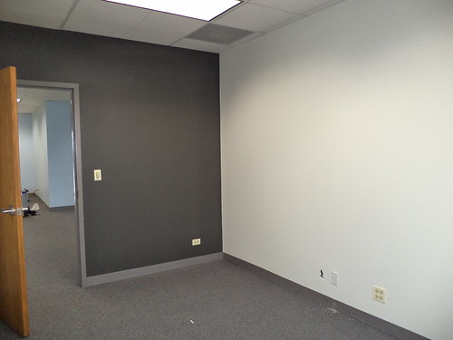
I had my idea. I was going to do two-tone gray; a dark, nearly black, gray on the wall with the door,
and a lighter gray on the other walls. The neutral gray would be offset by color in the things I display.
But, as I stood in that space and looked around, I thought, "I could do more than gray." This is what I'm getting.
On the window wall, and this is not the best of photos because of the lighting,
you can see I have a header and a large sill. This is an east window. This wall is Hawkeye gold. It wasn't called that but it matched the proper color. When I move in, photos will go on part of the sill. I will buy a plant stand for the left corner and put the white geranium I bought this year on the stand. I also have an aloe vera plant my sister gave me years ago and that will also go on the stand.
The wall with the door is still going to be painted a very dark gray.
I did consider black but I think it would have been too dark. The doors are going to be a honey oak stain. Our carpet has gray and blue and tan in it. (Somewhere I have a photo of the sample.) I also didn't want to feel "closed in" by the dark of the wall or have the bright yellow make it too hard on the eyes in the morning before the sun moved south.
There are these two long walls. This is the wall in the front area, where you'll enter the building.
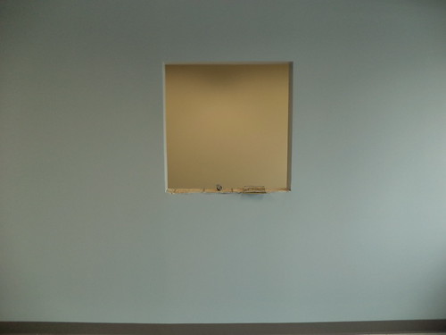
In the middle of this wall is to be a sliding glass window with a shelf. Incoming and outgoing mail will be dropped on this shelf. We have a magnetized sign that I'm going to affix to the bottom of the window to the left of the entry door. We are not the kind of company that gets walk-ins but we do want people to know where we are. This, and all common areas, is painted a light blue. The wall opposite this one is painted a darker accent blue. There is white tile with gray, black and silver accents in the entry and running to the back storage room. This will keep the carpet clean if we have deliveries come in the front door.
This is the long wall I've talked about before.
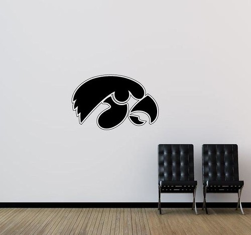
This is opposite where the window goes. In thinking about this, I decided to paint the two long walls a light ivory color which complements the dark gray and the yellow. On this wall will be stenciled a large Tiger Hawk, the logo of the Hawkeyes. This office is twice the size of my current one. I've looked at wall stencils, premade, which you just slap up on the wall. I don't think they are large enough. The Tiger Hawk is something I will do so it will be probably January before I get that done.
Originally, I was going to put my desk square with my back to the Hawk wall. But Mike pointed out that desks will have to go where outlets and internet get strung. I asked for the outlet and internet to be in the middle of the long wall. We'll see. I've also given some consideration to, if there is room, a diagonal arrangement in the northeast corner so I can look more at the entry to my office.
Our official move has been pushed back a week. We are low on boxes and are down to a lot of little items. Everything has to come off the walls. Bric-a-brac and souvenirs need to be boxed up. On December 12th, the moving company will come and take all the big stuff. Since we have until January 31st to be completely moved, Mike decided we'd toss material in our cars and make trips up at least once a day, assuming we're not out in the field. That way, we will be able to move all the little things and not worry about needing boxes. Plus, the movers won't be moving computers. We're doing that.
Mike said the contractor wasn't too thrilled that there were 11 different colors going on walls, but, because they screwed up our kitchen, they needed to make things right. He said most of the painting had been done, but he was unhappy with the color he picked for his office. We questioned it at the time, but he was insistent. Each one of us picked a different color for our offices and we picked a light tan for the bathroom walls. Tara and I are going to slowly add decoration to the bathrooms and we felt tan would be a great neutral background. We're talking about a beach theme in one and a garden theme in another. I am, of course, the one who picked three colors.
I'm not feeling wistful or nostalgic, yet. I expect that to happen once all the furniture, filing cabinets, and boxes of materials are moved. When I come in on December 14th to a largely vacant office, I'm expecting to be hit by a wave of sadness. I've spent nearly 16 years in this building. It's tough to let go of that. But what is exciting is designing a space which reflects me.
Before I left for my California vacation, I went to the new space to see my office. They had all the framing up for the other offices and our large equipment storage area. There was a huge kerfluffle about the "kitchen". Without checking with us, they made a closet at the front, where you walk in, 2.5 times the size we directed. This cut our kitchen space in half. Because of ADA requirements, the things we wanted to do in the kitchen could not be possible. To say Mike was angry was something of an understatement. Of course, the contractor absolved himself of any mistake, saying he worked off the plans and the architect, who drew up the plans, says what they built is not what he designed. The bottom line is that we had to do work arounds for what we wanted because of bathroom size and that they had walls framed up already. Realistically, we don't need much. Unfortunately, the requirements of the job are such that someone with a wheelchair would not be a candidate for employment with us unless we decide we need solely office help. Therefore, we can get by with what is a huge disappointment in a kitchen.
We were given a large palette of color samples and told to pick colors.
I had my idea. I was going to do two-tone gray; a dark, nearly black, gray on the wall with the door,
and a lighter gray on the other walls. The neutral gray would be offset by color in the things I display.
But, as I stood in that space and looked around, I thought, "I could do more than gray." This is what I'm getting.
On the window wall, and this is not the best of photos because of the lighting,
you can see I have a header and a large sill. This is an east window. This wall is Hawkeye gold. It wasn't called that but it matched the proper color. When I move in, photos will go on part of the sill. I will buy a plant stand for the left corner and put the white geranium I bought this year on the stand. I also have an aloe vera plant my sister gave me years ago and that will also go on the stand.
The wall with the door is still going to be painted a very dark gray.
I did consider black but I think it would have been too dark. The doors are going to be a honey oak stain. Our carpet has gray and blue and tan in it. (Somewhere I have a photo of the sample.) I also didn't want to feel "closed in" by the dark of the wall or have the bright yellow make it too hard on the eyes in the morning before the sun moved south.
There are these two long walls. This is the wall in the front area, where you'll enter the building.
In the middle of this wall is to be a sliding glass window with a shelf. Incoming and outgoing mail will be dropped on this shelf. We have a magnetized sign that I'm going to affix to the bottom of the window to the left of the entry door. We are not the kind of company that gets walk-ins but we do want people to know where we are. This, and all common areas, is painted a light blue. The wall opposite this one is painted a darker accent blue. There is white tile with gray, black and silver accents in the entry and running to the back storage room. This will keep the carpet clean if we have deliveries come in the front door.
This is the long wall I've talked about before.
This is opposite where the window goes. In thinking about this, I decided to paint the two long walls a light ivory color which complements the dark gray and the yellow. On this wall will be stenciled a large Tiger Hawk, the logo of the Hawkeyes. This office is twice the size of my current one. I've looked at wall stencils, premade, which you just slap up on the wall. I don't think they are large enough. The Tiger Hawk is something I will do so it will be probably January before I get that done.
Originally, I was going to put my desk square with my back to the Hawk wall. But Mike pointed out that desks will have to go where outlets and internet get strung. I asked for the outlet and internet to be in the middle of the long wall. We'll see. I've also given some consideration to, if there is room, a diagonal arrangement in the northeast corner so I can look more at the entry to my office.
Our official move has been pushed back a week. We are low on boxes and are down to a lot of little items. Everything has to come off the walls. Bric-a-brac and souvenirs need to be boxed up. On December 12th, the moving company will come and take all the big stuff. Since we have until January 31st to be completely moved, Mike decided we'd toss material in our cars and make trips up at least once a day, assuming we're not out in the field. That way, we will be able to move all the little things and not worry about needing boxes. Plus, the movers won't be moving computers. We're doing that.
Mike said the contractor wasn't too thrilled that there were 11 different colors going on walls, but, because they screwed up our kitchen, they needed to make things right. He said most of the painting had been done, but he was unhappy with the color he picked for his office. We questioned it at the time, but he was insistent. Each one of us picked a different color for our offices and we picked a light tan for the bathroom walls. Tara and I are going to slowly add decoration to the bathrooms and we felt tan would be a great neutral background. We're talking about a beach theme in one and a garden theme in another. I am, of course, the one who picked three colors.
I'm not feeling wistful or nostalgic, yet. I expect that to happen once all the furniture, filing cabinets, and boxes of materials are moved. When I come in on December 14th to a largely vacant office, I'm expecting to be hit by a wave of sadness. I've spent nearly 16 years in this building. It's tough to let go of that. But what is exciting is designing a space which reflects me.
Beverage: Water
Deb
Labels:
construction,
Iowa Hawkeyes,
Mike,
office,
painting,
work
Subscribe to:
Posts (Atom)