This may be my lone cross-stitch project this year, it's hard to say. It is important to me to get this completed as it's going to be a wedding present for an end of June wedding. I need to have it done probably by the beginning of May so it can be framed in ample time. I thought about just getting it done and letting the couple get it framed, but they could be so busy that it never does.
The first thing we start with is the fabric. I knew exactly what I wanted. It's called "Stardust" and I've used it before several years ago, to do a cross stitch of the Eiffel Tower. "Stardust" is tough to find and I have only seen it at Hobby Lobby. It's become a bit of a chore to get to HL but I wasn't going to pay 20% more to order the fabric online. On one of our weekend luncheon excursions, Pam and I swung by HL where I could get the fabric. The Eiffel Tower was done on cream-colored fabric with gold glitter embedded. For this project, I wanted the very light gray with the silver glitter.
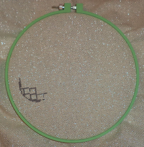
All set and with the colors for the project collected, I sat down to stitch. A couple hours and the form of the design is already taking shape.
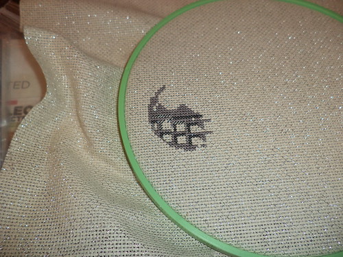
Day 2.
Day 3 with more added color.
After day 4 stitching, it is clear what this is going to be.
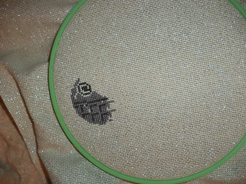
I picked up the next color and realized I had miscounted. Around the dark circle, there should be two lines of color, not one. The dark color needs to be moved northeast, if you will, to allow for the additional color. My heart sank. Did I want to rip all the dark out? That adds time. Plus, I get down because I should have figured this out when I was stitching it. Could I just work around it?
The more I looked at the pattern and what I had stitched, the more I realized I couldn't make it work. If I really want this to look right, I have to remove the dark and do that area over. So, that's what I've done.
Has it set me back? Well, not really. Ripping out color is a chore, but once that was done, stitching went quickly to reform the circle so I don't make the mistake of miscounting. Now that this is fixed, I can go forward from here. The design is not the hard part, actually. The hard part is placing the wording. That's coming.
Beverage: Dr Pepper
Deb


Looking good so far :)
ReplyDeleteI have no idea what it will be though :/
Nancy and the kitties